The latest design for a new Minnesota flag is inspired by l'etoile du nord
During the summer, I wrote a post explaining why the state of Minnesota needs a new flag and I presented a loon focused replacement. After posting, I was looking around for places to share the design and came across a Facebook Group dedicated to a new flag for Minnesota. I joined, shared the link, received very helpful feedback and was inspired to develop a much better design.
Before I reveal my preferred alternative design for a new flag, a history lesson is necessary to understand how I got there. The Facebook group, aptly named Minnesotans for a Better Flag, was founded as a way to advocate for a change to the Minnesota North Star flag.
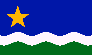
The North Star flag was close to becoming the state flag in 1989 there was a bill at the Minnesota state legislature to make it the state flag, but it was voted down. Yet there remains a small remnant of survivors keeping the fight alive.
The symbolism of the flag is quite good and well intended. As the official webpage for this flag notes:
The star recalls the state motto chosen by the pioneers, “L’etoile du Nord” (“The North Star”). The blue stripe represents our lakes and rivers. The white stripe represents winter. The green stripe represents our farmland and forests. Gold represents our state’s natural wealth. The waves represent the state name, “minisota” — a Native American name which means “sky-tinted water.”
However the design of the flag is — and I’m searching for the right word here — okay. In my opinion the colors are bit bland, and that star is too large. The wave looks a bit too much like Charlie Brown’s shirt (no offense to the great Minnesotan, Mr. Shultz). Needless to say, its fine, but I wouldn’t go out of my way to fly it.
As much as the North Star flag is a real improvement over the current state flag, we can do better. Minnesota is much more vibrant and progressive place than this flag represents.
A snapshot of the file in which I did the brainstorm, iterating, and improving.
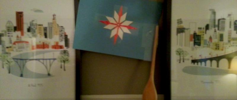
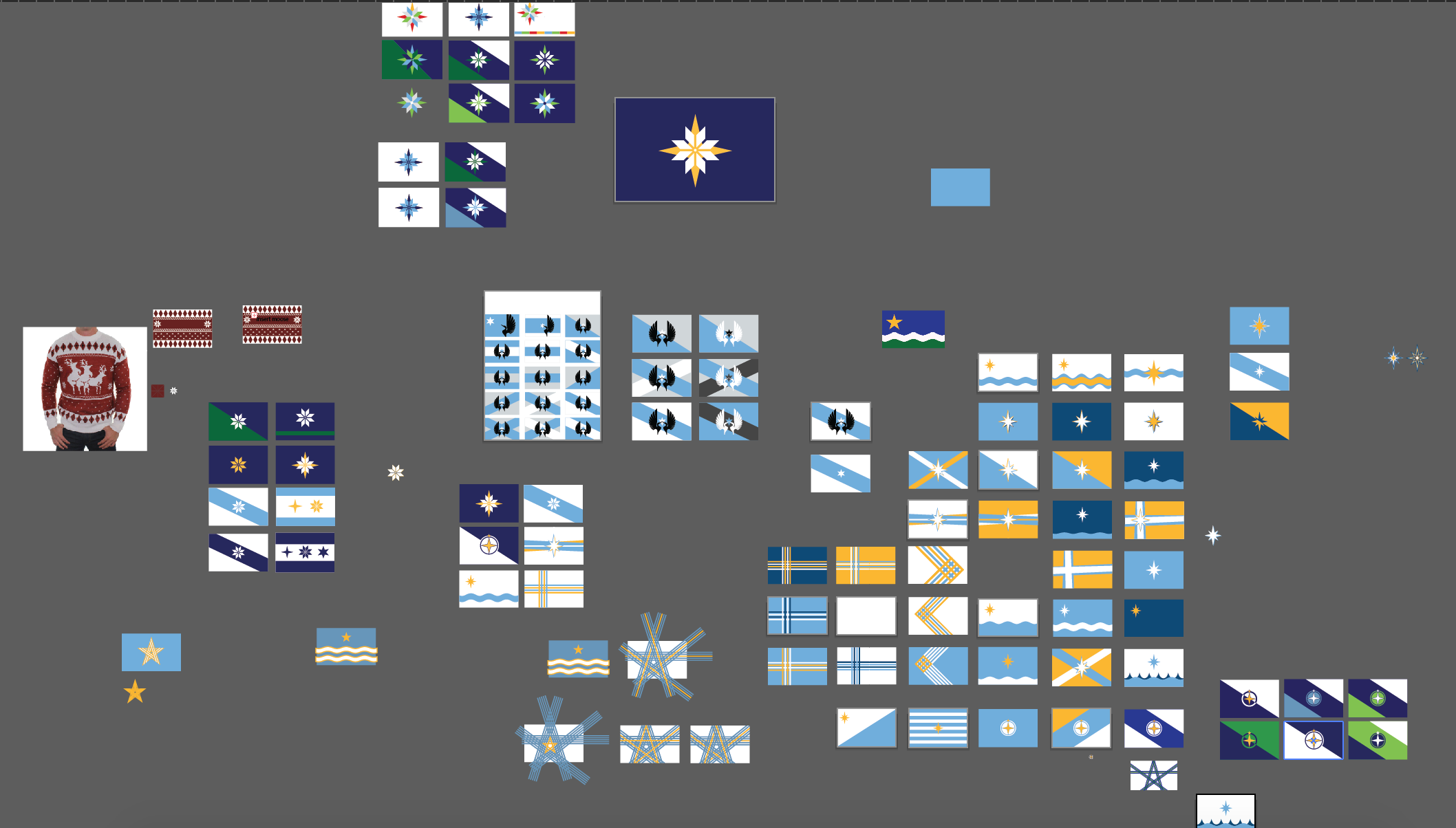
Therefore, I got to work. Creating, posting to the group, iterating. I went through at least 50 or 60 concepts and or iterations. At first I started riffing off the North Star flag, different types of stars and even an ugly sweater.
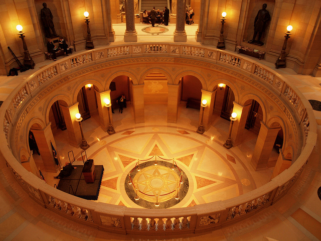
The floor of the rotunda at the Minnesota State capitol.
In sharing some of these concepts, a member of the group suggested using a variation of the star that appears within the rotunda of the State Capitol building. What makes this interesting is that the edges form to make four M’s. It also resembles a snow flake. Another group member, Aly Sevre, made the connection between the star in the state capitol and ugly sweaters.
I ran with Aly’s idea of the ugly sweater + directional star and I have to say it worked. While separate stars, they formed a cohesive and greater star (much like MPLS and StP are better together). Here’s a look:
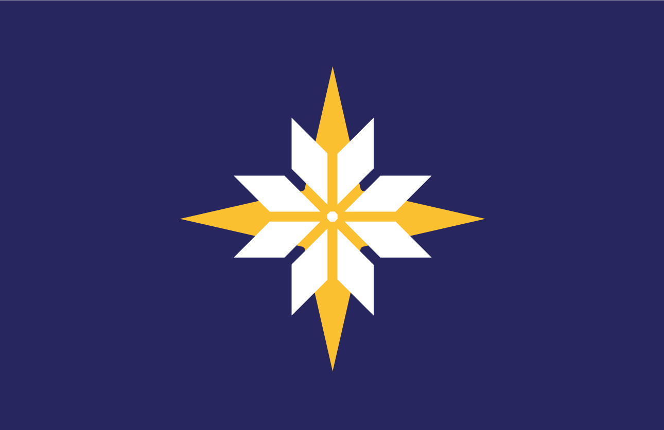
Folks, we have our winner. This flag embraces the outdoors and winter all the while coming across as progressive. I should also note that it meets all the criteria of vexillological design guidelines by remaining quite simple so it can scale and remaining distinct.
I’d be proud to call this the flag of the state of Minnesota, and I hope you would too. If given the chance by the state legislature, I will be submitting this in whatever crowdsourcing contest and process they cobble together.
But what I really want to know is would you fly it?
* I also want to formally thank the Minnesotan’s for a Better Flag Facebook group who kept the feedback and inspiration coming along.
This flag is now available in t-shirt form.