Minneapolis' love/hate relationship with the skyway, and how to make it suck a lot less (City Pages Version)
Minneapolis has 11 miles’ worth of skyways, according to Wikipedia, making it the largest skyway system in the world.
Editor’s Note: This post is an edited summation of my previous Skyway Map and Signage posts that appeared in City Pages. RIP, City Pages.
Take that EVERY OTHER CITY.
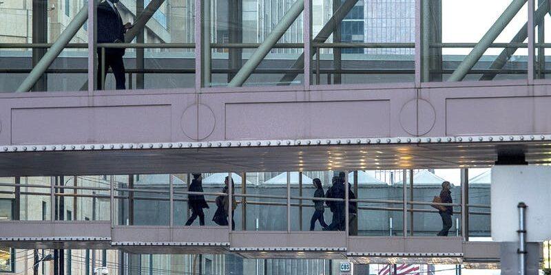
For the uninformed, the skyway is a convoluted and confusing collection of intra-building walkways that connects second floors (and sometimes first floors) of most (but not all) of the buildings in downtown Minneapolis.
That’s where I work. If I’m being honest, I can sense a real love/hate relationship Minneapolitans have with their skyway. There are reasons for both.
Love:
- The skyways are heated. Often times I can even forgo the coat on a walk to grab lunch or just stretch my legs on a sub-zero day.
- They help MPLS stay fit in the winter, and this is a super fit city. No foray into the skyway is complete without seeing a group of coworkers venting about spreadsheets while on a power walk.
- The Mighty Ducks rollerbladed through them once.
- I’m not sure Minneapolis gets to host next year’s Super Bowl without them. I can only imagine how cranky sport journalists already are about coming to Minneapolis for a week in February.
Hate:
- The skyways take people off the streets, which can feel empty by comparison.
- They can be much, much slower than just walking on the street.
- There’s an argument they hurt retail. So much so that the Dayton boys behind North Loop boutique Askov Finlayson have formed a skyway avoidance society.
- Is hosting that Super Bowl a good thing? Next year, Minnesota will invite football fans to our billion dollar, mostly taxpayer-funded, Viking-ship-looking, bird concussion provider. Even with the skyways, people will still complain. Get ready for a takedown from The Ringer.
- Most importantly, the skyways are extremely difficult to navigate with ugly and unhelpful maps and signage.
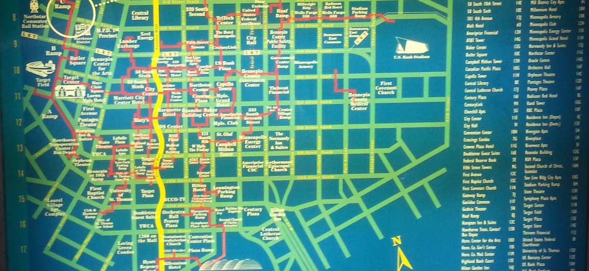
Seriously, here is the official skyway map. It’s almost impossible to follow the walking path (marked in red), but you can clearly follow the path of Nicollet Mall, in all its curviness… for some reason.
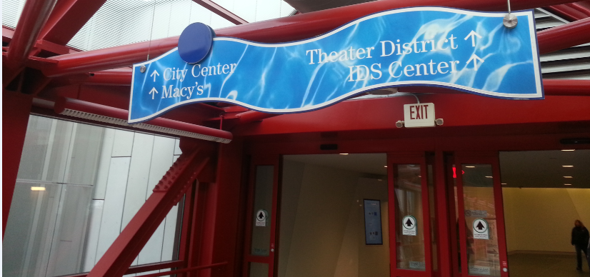
And here is an example of the signage: 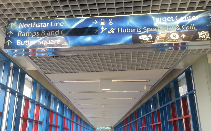
Ugh. Everything is wrong.
It’s like these were done in the ’90s when Photoshop first came out, and someone realized they could make water-like textures. So they did. And then 20 years went by, and the same sign was still hanging there.
Let’s just say that we can do better, Minneapolis. Much better! And not just for the sake of whiny sportswriters who will descend upon the city next year. For all of us.
Fortunately, the map and signage are fixable. I’ve taken this project on.
A literal skyway map is a mess any which way you try to attempt it. Just think of the layers of the skyway, which hangs above city streets while then zigging and zagging through buildings. I can’t really blame the map creators. It’s such a confusing system.
I’m suggesting we follow the transit (aka subway) map model, and deconstruct the skyway system.
When riding the train, only three things really matter: the stop, the route, and the destination. A train can go around a curve or two, but what’s that to you? The train is taking you where you need to go and it only stops at marked stations.
The legendary Massimo Vignelli brilliantly took advantage of this in designing New York’s subway map. You’ll notice he completely ignored streets, distances, and curves, instead using straight horizontal and vertical lines, and the occasional 45-degree angle. Colors signified routes, and stations were equally spaced dots on the map.
Today we couldn’t imagine a subway system mapped any other way.
Let’s apply Vignelli’s principles to the skyway and its jagged edges. First, identify what matters to the skyway user.
- Buildings, the skyway’s equivalent to a subway stop.
- Skyways, the routes connecting the stops.
- Destinations. The skyway walker doesn’t need to know north from south or east from west. (The city’s downtown grid runs northwest and southeast, anyway.) Instead, they should know they’re headed in the correct direction and getting closer to their intended location.
- Distance. Skyway users are, for the most part, walking. This means we can’t completely ignore the concept of distance. While not needing to provide exact distances, we don’t want to be wildly wrong, either.
- Streets. The skyway is in many ways an extension of, and connected to the street. Their blocks also form a good barometer of distance.
Taking these into consideration, I created the following map: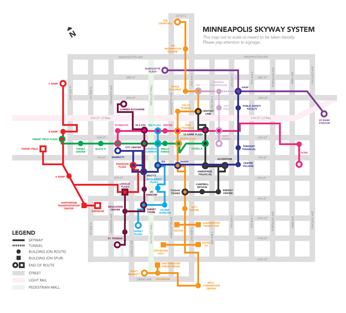 (Click here for a large PDF of Hundt’s Minneapolis skyway map. Editor’s note this is the most up to date version!)
Isn’t that so much more pleasant?
Some things worth noting:
- The street grid was changed to be completely vertical and horizontal, even though in real life, it’s not. This is in response to pedestrians not needing to orient themselves around true north.
- Skyways are made straight through buildings — unless there is an important jagged edge worth noting to users, or multiple paths through a building.
- I’m introducing routes to the skyway. This would help us let users know they are moving in the correct direction.
- I have yet to walk all 11 miles of the skyway to confirm the map’s accuracy, and created this version using old maps. Suggestions for improving the routes drawn here are welcome.
Even with a vastly improved grid, what good is a new map with the same old signs? For the Vignelli inspired transit map to work, it needs good signage. Simple to read, colorful, and clear.
Here, look at these.
I created these intending to fit the majority of signage that is currently in the skyway, though a recent walk revealed to me all kinds of unorthodox shapes hanging around. (The signs at both ends of Mayo Clinic Square [or Block E] are wave-shaped, for example.)
In the new and improved skyway, these unorthodox shapes would be replaced with the rectangular version. They should just be taken down, period.
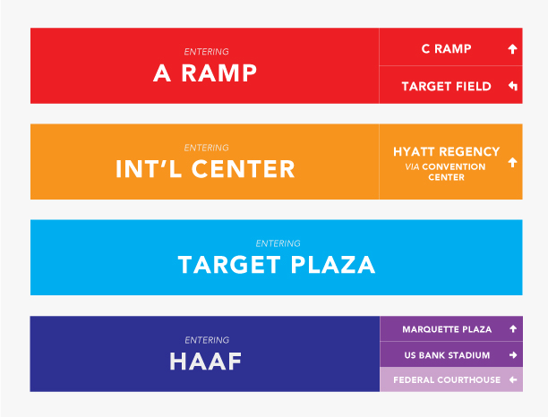
So, imagine you’re walking into the buildings listed on the image above. The color indicates the route you’re on, with the name of the building you’re entering labeled in the center. Down the right side, you could see other (future) destinations along the same route, as marked with the same color, plus alternate routes you will encounter inside that building, as marked by their respective colors.
On the occasion that you’re entering the final building on a route and there are no other crossing routes, the right panel can be omitted (see the Target Plaza sign).
Let’s look at how signs would appear if you’re entering the City Center building, the one laced with the most skyway veins in all of downtown. There are no fewer than seven entrances to that building. I’ve mocked up five, to show this system can handle even the most complex of scenarios:
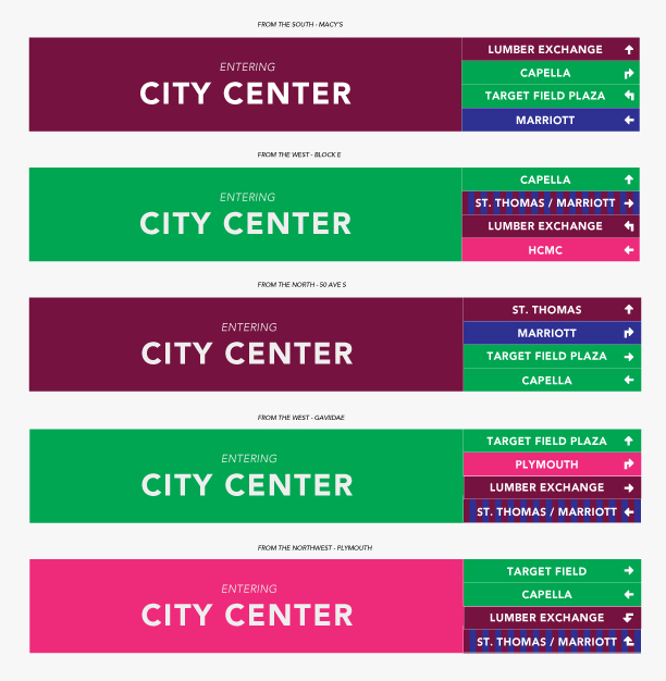
The color schemes and additional building names look like a lot to take in all at once. But after a few passes (and with the aid of a clean map) they’d begin to make sense, and become second nature.
Like how the experienced subway rider comes to know and intrinsically understand that system of colors, lines, and dots, without ever getting lost. Or even slowing down.
I wouldn’t intend the signs or map posted above to be the final version in the (admittedly unlikely) event the Downtown Improvement Council decides to put them to use. A reliable replacement for the current system should first be tested by surveying skyway users, and actual testing of walkers sent on assigned tasks.
Can Nancy figure out how to get out of the Westin Hotel (here, located on the “pink” line) and transfer to the “orange,” passing through three downtown buildings, to grab a drink in the historic Foshay Tower?
Can Jeff get from the (red) Radisson Plaza, use two lines and three buildings to pick up a prescription from the Target store on Nicollet Mall… then hook a U-turn, using two lines (blue and black) to make his meeting in the Ameriprise Financial building on time?
Most important: Can they do it without getting so frustrated they feel like shattering the skyway glass and leaping down to the street below?
Whether you love or shun the skyways, they’re not going anywhere. In the meantime, let’s make them easier to use for the benefits of those that work, play, and shop in downtown Minneapolis.