Better signage for the Skyway. Part 3 of the Minneapolis Skyway redesign.
In part 2 of the Minneapolis Skyway redesign series, I outlined the concept behind a minimalist map for the skyway. In part 1, I showed you the offensive signage for the skyways that exists now.
For the Vignelli inspired transit map to work, it needs good signage. Simple to read to read. Colorful and clear. I’ll try to keep this brief:
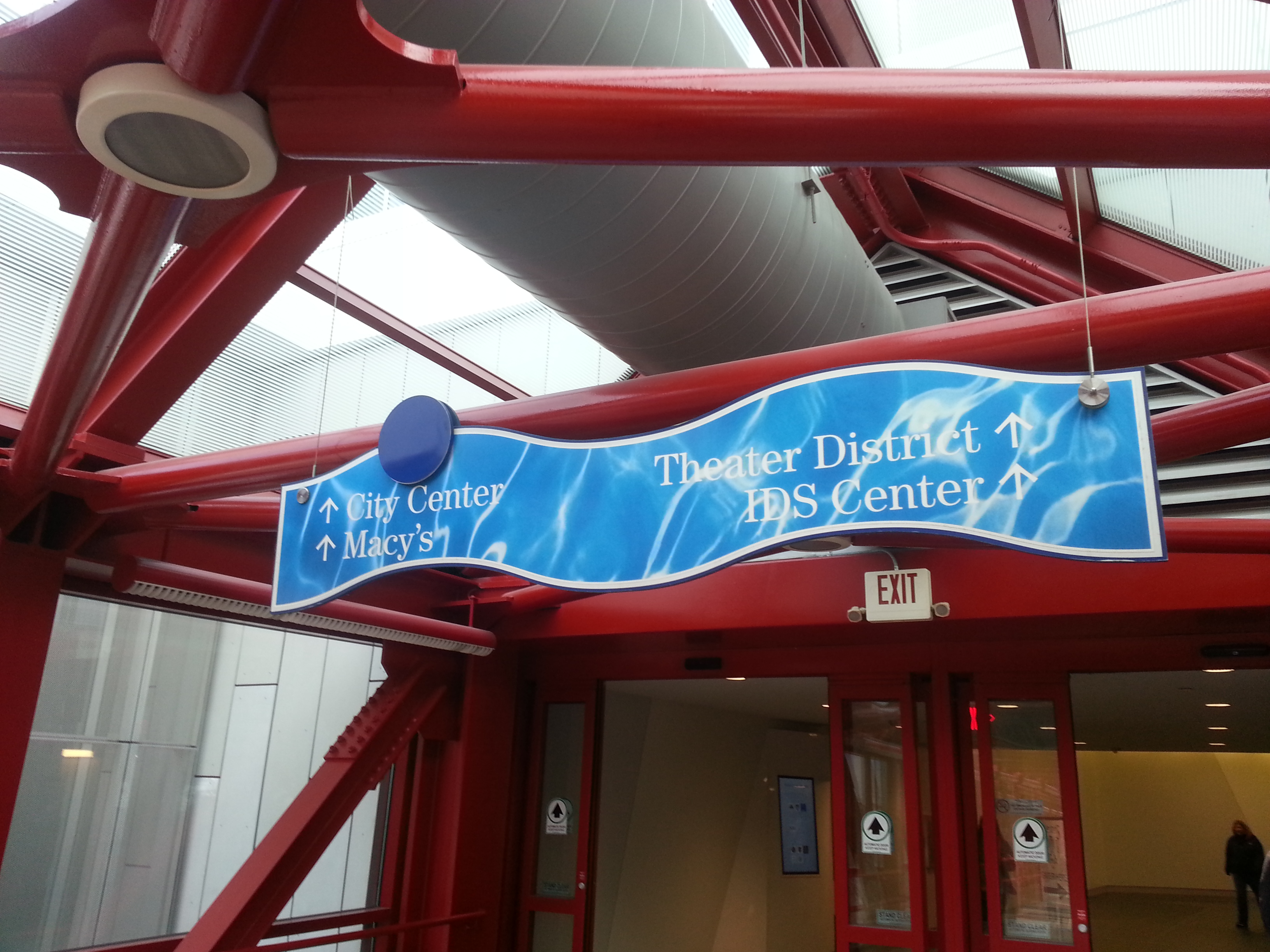
First, I created these to the size that is intended to fit the majority of signage that is currently in the skyway. However, a recent walk through the skyways revealed to me all kinds of unorthodox shapes to some of signs (the signs at both ends of Block E - now known as Mayo Clinic Square- are waved shaped). The unorthodox shapes would need to be replaced with the rectangular version. They need to be replaced in general.
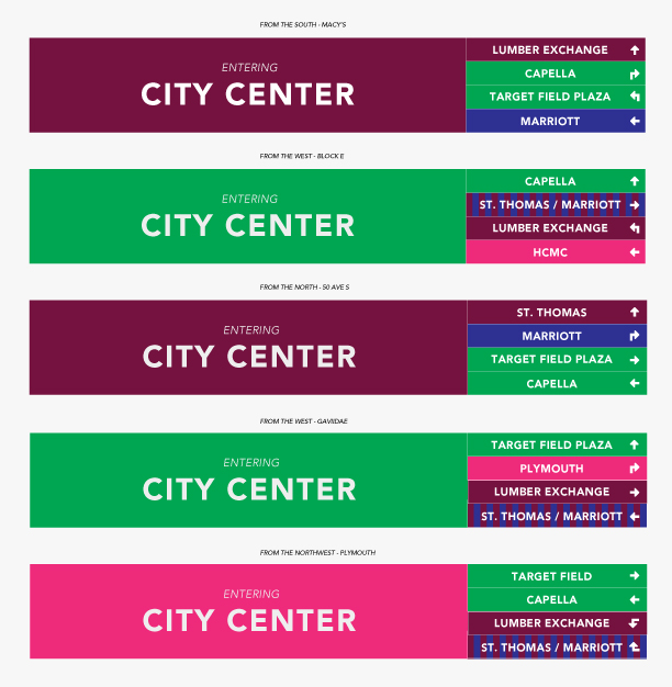
Now imagine you are walking into the buildings listed on the image above. The color indicates the route you are on with the name of the building listed on top. A right panel is included to show any routes you may encounter while inside the building color coded to the route.
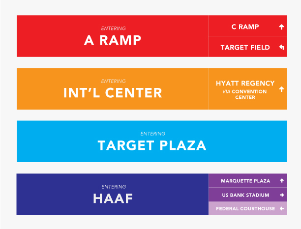
On the occasion that it is the final building on a route AND there are no other crossing routes, then the right panel can be omitted (see the Target Plaza sign).
Also on the occasion that you are passing through a building with no other crossing routes, but the skyway continues, then the right panel can include more information about a popular destination upcoming on that route (see the Int’l center sign).
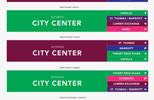
Lastly, I want to show what the sign would look like if you are entering the building with the most skyway entrances - City Center. There are no less than seven entrances to that building. I have mocked up five of them to show you this system can handle the most complex of scenarios:
A conclusion to the series
I would like to conclude this series by stating that I would not intend these signs or the map to be the final version in the admittedly unlikely event of them being put in use. But if they were to be put into use, I’d recommend a phase of user testing involving surveying on test portions of the routes and actual testing of users on assigned tasks.
That said, whether you love or shun the skyways, they aren’t going anywhere anytime soon. In the meantime, let’s make them easier to use for the benefits of those that work, play, and shop in downtown Minneapolis.
I’d appreciate you thoughts on this thought project, the good, the bad and the suggestions. I’d love to know if you actually try the map. Feel free to post your thoughts and experiences in the comments! Tally ho!