Adventures in vexillology - a new flag for Minneapolis
A good city flag can provide a rallying point for civic pride and the template for the design code of a city. Just look to Chicago or Washington DC as examples. Unfortunately, in a TED Talk, Public Radio podcaster Roman Mars points out that most city flags are abominations and embarrassments. While I was relieved that my home city of Minneapolis wasn’t on Mars’ worst list, I also couldn’t tell you what our flag looked like. Thats not good. A good flag will be flown.
Mars points out there are five rules to good flag design:
- Keep it simple
- Use meaningful symbolism
- Use two to three basic colors
- No lettering or seals of any kind.
- Be distinctive
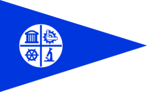
Lets now take a look at the current flag of Minneapolis:
Ok, its simple, only uses two colors, and doesn’t include lettering… BUT its so bland! It is not distinctive or meaningful in anyway. Any city can claim the four tenants in the symbol. It no wonder you don’t see it flown anywhere in the city. Minneapolis is too vibrant of a city to have too dull of a flag.
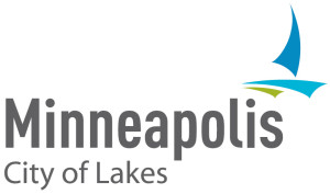
To create a new flag for Minneapolis, we should do due diligence and research the existing symbols to find a distinctive element. For this I turn to the revamped logo. And by revamped, I mean brought from the 50s into the 90s. However, with the logo we finally find a distinctive element, the sailboat. This makes sense for the city of lakes. We can potentially use this.
The last piece of inspiration I felt is appropriate for the city of Minneapolis is actually a newer logo to the community, the logo for Minnesota United FC. Its a stunning logo, fitting of a modern city and is intentionally flag like. Now that MNU is joining MLS the fans deserve a distinctive local flag to wave at games, ala our civic rival Portland.
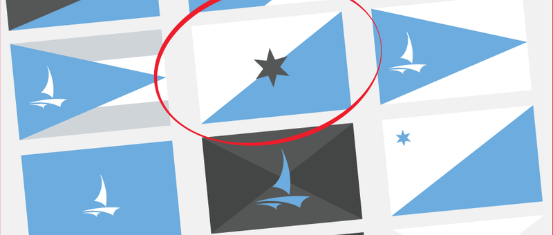
Considering all of this, I’m down to two proposals for the new flag for Minneapolis. Here is the first:
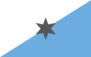
Using the iconic sailboat symbol the view is brought immediately to the City of Lakes. The light blue represents the 20 or more lakes in city limits. The white represents our embrace of the winter. The charcoal gray represent the modernity of the city, our hipster-ness, if you will. The 45 degree diagonal line represents Minneapolis’ geographic location on the 45th parallel, halfway between the equator and North Pole. The last element I’m borrowing from MNU, the North Star. This represents Minneapolis’ position as the leading city of the True North and as a guide for the rest of the country to follow.
I like it, but where I’m torn is with the sailboat. Is the iconography strong enough? Do we need it? Perhaps this flag needs to be simpler. Here is my second suggestion:
UPDATE: After some great feedback on Facebook. I have a third and final proposal. This is the winner and ultimate suggestion. The sailboat just isn’t strong enough a symbol.
Would you fly this flag? Granted I did this for fun, but if you like it enough feel free to share this link with any Minneapolis city council members. Thank you Roman Mars for the inspiration.
UPDATE: Read Part 2, where I redesign the flag for the state of Minnesota.
Or visit my other flag related posts:
