Ranking the Best and Worst License Plates

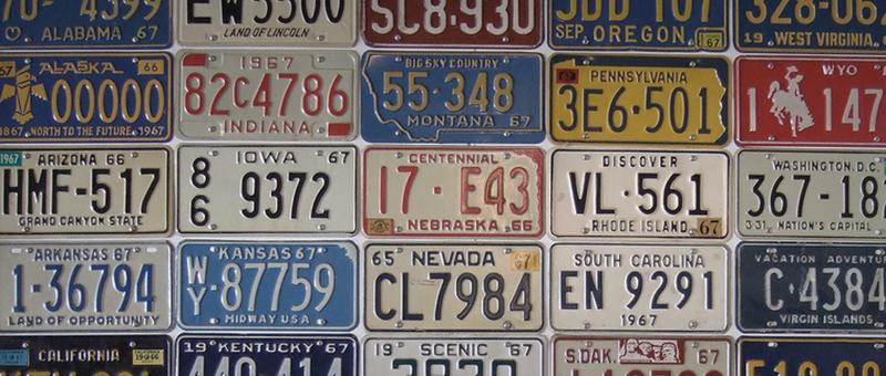
The license plate game is the quest to find all 50 state plates in one road trip. As a kid, my dad would play this game on every trip we took. During the times I sat shotgun, I remember being ready to cross another state off the list as soon as we saw a new plate. This was always fun and exciting for me as I have always been a bit of a political geography junkie.
In my possession was also a road trip activity book that included a section on the license plates. I could name most of them without seeing the states name. So my experiences as a kid coupled with my graphic design background, have allowed me to create the following criteria for quality license plates:
- Readability: This is simple enough. Can you read the number on the plate? Is the font choice acceptable? If an Amber Alert is posted, will you be able to ID the perp by the plate or will they escape to another state? After all, design is first and foremost about function. And a license plate’s primary function is to allow for the identification of any vehicle.
- State Reflection: Does the plate reflect the character of the state? Also, is the slogan on the plate reflective of the actual state. For example, Ohio’s plate calls the state the Birthplace of Aviation. This bothers me because the first flight occurred in North Carolina. Granted the Wright Brothers were from Ohio, but they had to leave the state to fly. That’s a red flag to me, despite Ohio’s decent new look.
- Praise / Embarrassment factor: Is your state better viewed because of your license plate? Do you want to drive your car out of state with the plate? For a lot of people, all they will ever see of your state is the license plate. Does it give a good impression? Does your car’s value drop because the plate is so ugly?
Ranking the State’s Plates
Without further ado here are my top five and worst five state plates. For reference here are a couple of sites that show the main plate from each state. This site has a list up to date to 2010 & this is an ugly, yet up to date site that allows you to see the plates of the past 20 years.
Top Five State License Plates
(Starting with the best. If the image isn’t displayed, I couldn’t find one with the appropriate rights to post for the web. Just click the link provided.)
1. California: It’s readable, the script for California reflects the state, and it makes your car much cooler for simply having it on it. 3/3 on the criteria. Well done California. Don’t change a thing!
2. Alabama: I think better of Alabama after seeing their new plates. The background of the plate is well designed and the text is readable. Also you can see their progression, and how unexpected this well designed plate is.
- New Mexico: It’s too bad New Mexicans don’t make it up to the upper Midwest more often, because they have a nice plate. But can you blame them for not wanting to visit? The plate fits the state. I also appreciate that they added USA to the plate to not confuse an ignorant motorist who may have thought they were from Ole Mexico.
4. Colorado: New Mexico’s neighbor to the north has a fine plate themselves. I kind of think its tough to have a clean silhouette of anything, but Colorado manages this with the mountains. This plate also makes passing motorists jealous that they aren’t in the Colorado Rockies.
- Hawaii: The rarest of all plates to see on the mainland would be a treat to see indeed. This plate has a retro feel with the use of the condensed font in the numbering. I can imagine it complimenting beach going vehicles like woodies and convertibles very easily.
10 Honorable Mentions (in alphabetical order. See this list for photos): Florida, Georgia, Iowa, Minnesota, Mississippi, Nebraska (the new one), North Carolina (the actual first in flight), Ohio (just give up the slogan), South Carolina, and Washington.
Bottom Five State License Plates
(Starting with the worst. If the image isn’t displayed, I couldn’t find one with the appropriate rights to post for the web. Just click the link provided.)
- Washington DC: Okay, so it’s not a state, but this is one ugly plate. If that weren’t enough there’s one thing that stands out like none other: the slogan “Taxation without Representation.” What is funny is that DC residents pay Federal taxes without representation in either house of Congress. And this is precisely why the slogan appears on the plate. Yet, I contend that plates should be politics free, even in DC. (For the record, this is despite my personal belief that DC should be represented in the House of Representatives, along with all of our territories). Unfortunately, my gut is also telling me this slogan would be lost on the average American. Sorry DC, but ugly font choices plus a political statement that is confusing to non-DC’ers equals the worst plate.
2. Connecticut: This plate is a classic case of a gradient gone wrong. Throw in the use of Times New Roman and you’ve got one hideous plate. I remember seeing this plate on an Audi a couple of weeks ago and it just ruined the look (and subsequent value) of the entire car. Connecticut has the third highest median income out of all states, so the number of luxury vehicles driving around is probably higher than in most states. Its too bad these vehicles are hard to appreciate with that plate on them.
- Indiana: Come on Indiana, your plate is becoming steadily uglier by the progression. Please revert back to your 2000 version. That’s at least a top 10 plate.
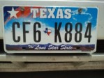
4. Texas: The most recent Texas plate is unfortunate for this reason, its too busy. When I think of Texas I think of its size, its flag, and its simplicity. This should lead to a nice plate. If you see its “Red Texas” plate from 1991-1994, you see it works much better than its current plate. Here’s my advice: Keep it clean, keep it focused, keep it simple.
 New York: Home of Madison Ave and the fashion industry. It is the center of the design universe and we get that for a plate? The curve is ghastly and the colors are wrong. It just doesn’t feel like New York. I’m really just disappointed its not better with all of the design talent inside the states borders.
10 Dishonorable Mentions (in alphabetical order. See this list for photos): Alaska, Arkansas, Idaho, Maryland, Michigan, Nevada, New Jersey, West Virginia, Wisconsin, and Wyoming.
Agree? Disagree? I’d love to hear your thoughts!