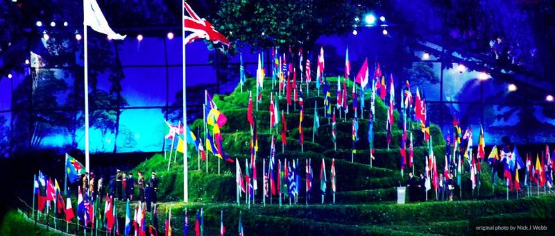
Adventures in Vexillology: The Top 10 Best Designed Flags
David, the mind and Maus behind the always thought provoking mindofmaus.wordpress.com, recently approached me with an idea for a collaborative blog post. Here is the chat excerpt:
“…we each write a post or series of posts ranking our top [10] picks for best national flag. You do it from a design perspective. I’ll rank them on historical/political symbolism…”
The offer was just too enticing not to accept. So please read his post as these are meant to exist together like Tanganyika and Zanzibar. That said, make a mental note we intentionally decided not read each other’s posts ahead of time. So it is quite possible this collaboration could turn out to be as unified as Czechoslovakia in 1992. I choose optimism.
And in the spirit of this optimism please feel free to play this video while reading for full effect:
The Four Principles of a Well Designed Flag
Before we delve into the rankings, I must first explain the criteria for my rankings. Allow me to Introduce to you The Four Principles of a Well Designed Flag (TM, Copyright, Patent Pending) which happen to be somewhat similar to the criteria I used to rank the license plates:
- Design must serve a purpose. The purpose of a flag is to stand as a representation of a given country. Good design can achieve this. In other words, one must always ask if it is an accurate portrayal of the nation.
- Great design excels in its simplicity. Was your flag put together with simplicity or are you trying to put everything your country stands for on its flag? Simply put, is your flag a scrapbook? If so, sorry, you will not appear on my list.
- Good design evokes an emotion. A flag should make you feel something. For Americans, seeing Old Glory basking in the morning’s first light conjures up emotions of sacrifice, unity, and freedom. Seeing a Perkin’s sized Chinese flag while actually in China was eerie for me, it was a reminder that I should be on my best behavior.
- Good flag design translates into fashion. Can your country put your flag on a jersey and wear it with pride or will you look ridiculous? Yep, those are Nike knock-offs.
*Australia, New Zealand, and the Netherlands will be excluded from the rankings because their respective flags miss in at least 3 of categories. Most notably that their sports teams don’t even wear the colors of their flag; meaning their flag doesn’t represent their country; meaning their flag fails to evoke an emotion that exceeds that of athletics. My advice to these three, change your flag.
The Rankings
I have categorized this list into two categories, Honorable Mentions (I will not explain), and the top 10 (which I will explain). You can follow along using this list.
Just a mention: The United States of America
Since I am an American and most of the readers of this post are too, I feel that I should explain why the Star Spangled Banner does not appear in my top 20. While the American flag evokes emotions (see above) it misses on many of the guidelines listed above. It’s not simple. It’s kind of clunky. It also takes too long to explain its meaning. Also, U.S. flag jerseys just look ridiculous (see here) and I really don’t like the new flag look for the national soccer teams. Please bring back the white tops!
To sum up, it’s a decent flag, but its meaning by far outweighs its design chops. Sorry Betsy Ross.
Honorable Mention:
(In alphabetical order):
- Argentina
- Bahamas
- Brunei
- Estonia (the best of the tri-colors)
- Lebanon
- Nepal
- Somalia (come on let them have this. I’m fairly certain they don’t end up on too many ‘best of’ lists)
- Sweden (the best of the Scandinavian crosses)
- Tunisa
- and the Vatican City
The TOP 10:
#10: Barbados
 The only “North American” entry in my top 10 belongs to this tiny Caribbean nation. They did a nice job of fusing a traditional tri-color flag with a clear symbol that appropriately reflects the island nation. The color is a little muted, but that trident is just too dang cool.
#9 Brazil
 Brazil gets bonus points simply because their flag translates well to their soccer jerseys. It’s the most awe-inspiring kit out there. But what makes this bandeira top 10 worthy is its curved arch that gives the circle element a sense of depth not seen on many other flags. Ordem e Progesso indeed.
#8 Bhutan
 One of the most isolated countries on Earth has surprisingly one of the best flags. It has a unique color set (not red or blue) and pulls off a subtle diagonal. I can imagine the teams athletic jerseys if only they competed! But let’s be honest this flag has a dragon holding four orbs. What is better than this? (Clearly, 7 others).
NOTE: Rachel disagrees with me on this one. She doesn’t like the dragon and thinks its too complex to put on a flag. When I asked her to point out a simpler dragon, she recalled Trogdor. She wants consument V’s, consument!
#7 East Timor
 This flag is sharp. Solid color is in use with many standard flag elements (triangle and star, see Cuba, Puerto Rico) but where it sets itself apart is the tiny sliver of gold that forms an oblong triangle. It’s the subtle touches that tell the story.
#6 Albania
 Bold, Confident, Traditional, and Pride are the emotions that are evoked looking at this stunningly simple banner. Ultimately, this is a battle flag, and being a Balkan state this has been followed into many wars. Wait, I’m probably delving too much into David’s territory here, but if he wanted to fight about it, I’m bringing this flag with me. Also, you may notice this is the only flag with an eagle that made the list, but its a double eagle all the way the across the sky (remember this craze?).
#5 Uganda
 David’s home for the past year makes my list mostly due to its color. They also take the tri-color to a new level by repeating the yellow, red, and black bands. The crested crane is a bold choice in a landscape dominated much more intimidating birdlife (see #6).
#4 Switzerland
 This flag is on the list because of its understated simplicity. Yet, this flag also fits the Swiss persona so well. I think that Swiss designers are constantly inspired by their flag. Just look at the Swiss influence in Typography and products like Swiss Army Knives. The are all understately simple. Coincidence? I think naught.
#3 Kyrgyzstan
 This flag represents the hope of a people who are in need of some hope. Yet the flag remains simple, has good color, and the symbol would make for a nice patch on an athletic jersey. 4 for 4!
#2 Saudi Arabia
 This is a sharp, sharp flag. Why sharp twice? Because the Arabic typeface in use looks sharp, and that sword looks sharp. It’s also a fitting representation for a country that still uses swords to chop off the hands of thieves.
#1 United Kingdom
 It may be shocking to you, but the flag I like the most from a design perspective is that of the United Kingdom. The Union Jack just hits it on all levels. It uses space well, forms an interesting pattern, and the colors are labelled appropriately. The texture in the details of the flag is also done well, it gives it a solid layered feel. It also is fashionable (oversized hats withstanding) and allows Team GB to confidently compete in style. I selfishly hope that England, Scotland, Northern Ireland, and Wales stay in a union just to preserve this flag.
One Closing Thought…
David, please don’t miss the opportunity in the next year to gaze upon with splendid awe the Union Jack whisking high above the spires and smokestack along the great River Thames whilst enjoying your Marmite and toast.
In closing, did you think there any snubs? Were some over ranked? Did I just nail it? Please chime in below!