After George Floyd, we need a new Minneapolis Flag

Editor’s Note: This post was written in summer 2020, but wasn’t published until February 28th, 2021. I decided to preserve some of my thoughts and emotions after the murder of George Floyd. I provide updates where appropriate.
Its been a tough few weeks in Minneapolis since the brutal murder of George Floyd at the knee of Derek Chauvin. Our city is forever changed.
As the neighborhood watches slow down and the city gets a chance to take a breath – something not afforded to our neighbors of color – I’ve been thinking about how Minneapolis could use a new symbol to capture our collective anger and hope for a more equitable and just city.
We need a new flag. A banner to rally behind as we begin to lead the nation in a discussion on police violence and the lack of equity in Minneapolis.
This might seem minor, especially in the midst of a debate to defund the police, I’m suggesting we review the symbols of Minneapolis, specifically the flag. But I fully believe that symbolism matters.
Symbols can serve as a uniting or dividing force. For example, one can learn a lot from an individual that displays a Confederate flag at a NASCAR race or can learn a lot about a state that chooses to keep it on their state flag (ahem Mississippi).
Editor’s Note: Mississippi now has a new flag.
Symbols can be oppressive and symbols can also give hope and be a source of civic pride. They can also be quite irrelevant.
Residents of DC, must have been filled with pride when they saw aBlack Lives Matter street sign complete with the DC flag. It’s their street. DC did that.
When visiting Chicago, you are more likely to see the city flag than the Illinois or American flag.

This brings us to Minneapolis. Our existing symbols are mostly irrelevant. The sailboat motif is common, but not embraced by the public. The city flag (shown above)? It’s only flown at government buildings and has irrelevant symbolism.
Minneapolis is on the verge of doing something historic by being the largest city to potentially defund a police force. We need to become more equitable. A new flag can serve as a reminder to always do better.
New Symbolism:
In West Africa there’s the Sankofa bird, it looks backwards as it moves forward and has become a symbol of hope for African Americans in the fight for racial equality. Always reflecting, never forgetting as it moves forward on its journey.
As Minneapolis started burgeoning as a milling city along St. Anthony Falls, let’s not forget on land stolen from the Dakota, it would have been common to see many water wheels churning in the Mississippi River. The waterwheel can take on a similar symbolism to the Sankofa bird - in one full rotation the wheel needs to go backwards as well as forward. We should always remember our past as we move forward.

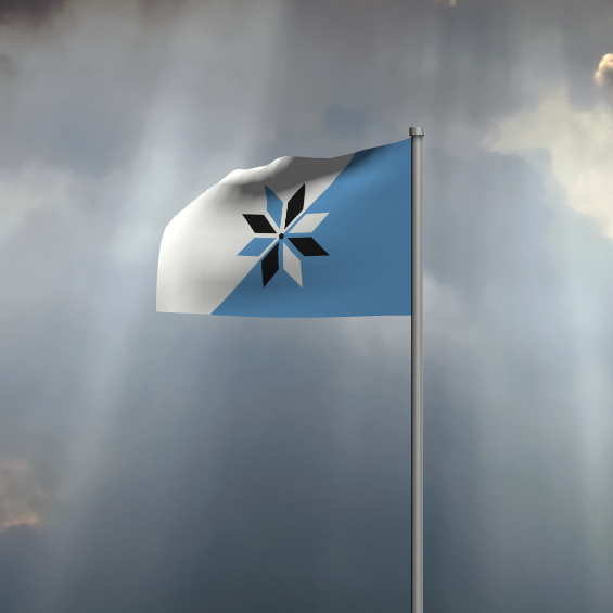
I hope to have designed a flag that encompases these features.
The field (non-nerds call this a background) is separated into two equal quadrants separated by a 45 degree angle. The angle represents Minneapolis’ geographic location on the 45th parallel, halfway between the equator and the north pole.
Colors: The hoist side (or the side of flag pole) is blue symbolizing the city’s relationship with water, or mne in Dakota. The white represents winter as Minneapolis is the coldest major city in the contiguous United States.
The angle is also shaped like St Anthony Falls, the waterfall that gave this city its birth and initial prosperity as a milling town.
Symbol (or in flag parlance, the “charge”): The city motto is En Avant (French for ‘Forward’) _as represented by the water wheel moving in a forward direction. _The multicolored snowflake symbol is an intentional embrace of the city’s liberalism - that also takes on the perpetual forward motion of a waterwheel over the falls when provided in multiple colors; embracing both the highs and the lows of its history.
A water wheel must travel backwards in order to go forward. The four black branches remember the following significant events:
- We remember that the land Minneapolis now occupies is stolen from its original Dakota occupants.
- We remember those that died in the violence of the workers strikes of the 1930s.
- We remember the vast inequities for people of color specifically through institutionalized acts of segregation in housing through the embrace of racial covenants and redlining.
- We remember the victims of police brutality, notably, but unfortunately not limited to Jamar Clark, Justine Diamond, Thurmin Blevins, and George Floyd.
The remaining branches represent the four quadrants of the city (North, South, Northeast, Southeast), moving together.
The flag:

While I hope you like the flag or at least appreciate a few of the thoughts behind it, I’m not naive enough to think that this would just become the flag of Minneapolis with a single Council resolution. Ha! It doesn’t work like that. Milwaukee, Rochester, and countless other towns have shown this.
What I hope this starts is a discussion about our city’s symbols, regardless of my proposal. My proposal will have its own built in perceived biases, and its the proposal of one person. Therefore, likely flawed in some aspect.
I welcome your feedback, suggestions, and a discussion about Minneapolis’ symbols. I’m over at @brandonhundt2 on Twitter.