Is it really a snowflake? And other questions I attempt to answer about Minnesota flag finalist F29
Since learning that my submission for the State Flag of Minnesota is one of six finalists, I’ve been in a dazed state of nervous anticipation. Apologies to my family and my work colleagues if I have been a little lost in distracted thought. Thinking about this flag and this process are now my peak Roman Empire. Et tu, Brute?
If you have seen any of the conversation on Minnesota social or local media about the finalist flags you will see Minnesotans and vexillologists have A LOT OF THOUGHTS ABOUT THE FLAG! I view all feedback like this as a gift. Being a designer means knowing when to make changes based on feedback and when not to. There are also trolls. Ignore them.
WOW! I'm simply thrilled that my flag received the most votes from the State Emblems Commission this evening.
— Brandon Hundt (@BrandonHundt2) November 22, 2023
I am very eager to work with the Commission to address their feedback and make the flag even better. Onwards to a #newMNflag! @RepFreiberg https://t.co/Fe95jdXK9I
The firehose of feedback can be grouped into common themes. I do my best to lightheartedly answer common questions. This is a resource for you. If you read it all bless you.
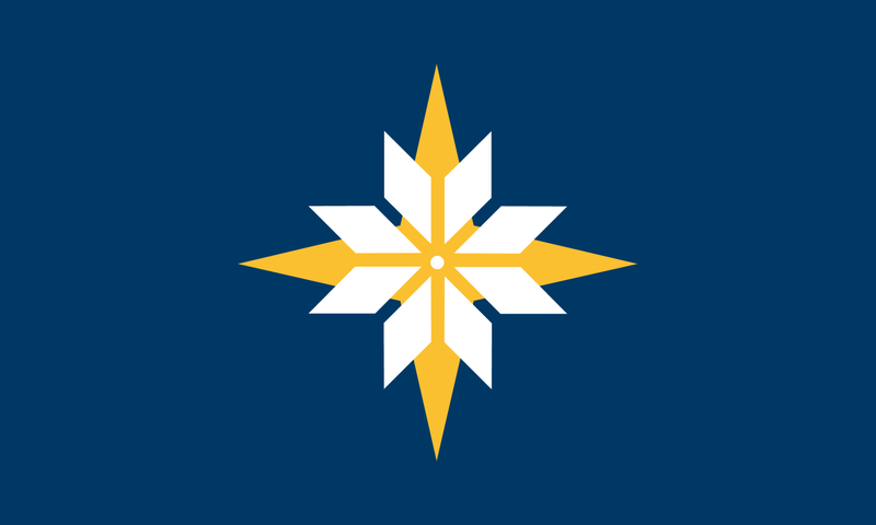
WHAT IS THE SYMBOLISM OF F29?
Ah, this is a good question to start with. I wish the Commission had posted the symbolism along with each submission because context is important for understanding design choices. Here’s what I’ve been running with:
Blue: Mni Sota’ Sky-tinted water: The land of 10,000 lakes. The Great Lakes begin in Duluth. The Mighty Mississippi is formed in our state. If any state has a case to have a blue flag, it is Minnesota.
The Directional Star: “L’etoile du Nord” The North Star. If you follow the North Star, you will end up in Minnesota. Gold represents the rich resources of the land.
The Snowflake: Winter We embrace it. Put on a sweater and stay warm. As a bonus this is also the shape of the star on the floor in the rotunda of the Capitol building in Saint Paul.
AH HA! SO IT IS A SNOWFLAKE!!! WELL ACTUALLY, SNOWFLAKES HAVE SIX SIDES!!
The original intent (conceived eight years ago) was to riff off of knitted sweaters - which feature eight-sided selburoses - not snowflakes. The eight-sided star is also a prominent symbol to local tribes. The more you look for it, the more you already see it across the state.
Bonus: The eight-sided star is based on the floor of the Rotunda in the Capitol building and has the hidden benefit of creating hidden M’s - sorry no hidden Loons here.
Maybe I need to update the symbolism to remove the word “Snowflake” but the name “Snowstar” is growing on me…
So to answer your question, no, I would not make changes to the number of sides in the star.
REMOVE THE DOT!!!!!!
Selburoses have a centered element. Dakota stars do not. If the Commission so chooses, the dot can be removed.
IT’S TOO SIMPLE FOR A FLAG!!!
It is not. Flags should be simple. In fact, the leading vexillologist (a person who studies flags by the name of Ted Kaye) thinks the symbol might be too complex, maybe? If elements are added to it, the emblem gets lost. Please believe me when I say that I’ve tried many many many ways to add to the flag, but it usually ends up distracting from the emblem itself.
Also, please consider other flags. If you find this flag boring, you might find all flags boring! Fashion is a choice. Ukraine’s flag 🇺🇦 is so simple, yet is an enduring international symbol of the independence of their people.
For those who think the MN final six flag designs are boring, consider:
— Brandon Hundt (@BrandonHundt2) November 22, 2023
1. 🇯🇵🇱🇨🇧🇷🇨🇭🇧🇩🇨🇾🇭🇰🇰🇬🇸🇴🇲🇦 (center on solid field)
2. 🇺🇦🇫🇷🇯🇲🇮🇪🇩🇪🇮🇹🇵🇸🇿🇦🇹🇿 (rectangles, triangles, lines, and colors, you know most of these!)
3. 🇨🇦🇧🇧🇦🇷🇱🇧🇨🇳🇮🇳🇰🇪(More flags you may know)
Keep it simple!
WE SHOULD COMBINE IT WITH ANOTHER FLAG!!
See above. This emblem doesn’t work as a canton — it gets very lost up in the corner. Combining adds too many colors. It loses emphasis with an unnecessary swallowtail. Stripes are unnecessary for this design and they neuter the impact of the emblem. I’ve tried it all. TRUST ME on this.
A Special NOTE for the “We need a swallowtail crowd”: It’s cute that a swallowtail evokes the shape of the state. Keep in mind that swallowtails are most commonly used for Naval Ensigns, and I strongly feel it’d be out of place to use them for the official variant. But if you have a boat, by all means, pay extra to cut that MN-shaped wedge into the flag - as long as you promise me to not exclude the NORTHWEST ANGLE!!!
IT LOOKS LIKE SOMETHING SIXTH GRADER CAME UP WITH!
Sorry to inform you that this is not the diss you intended. I have a sixth grader, I’m very proud of her. She is not an insult.
Flags need to be visible and distinctive from the top of a flag pole at far distances, meaning the best flags are stripped down to only the necessary elements to convey the symbolism. Again, we turn to Ted Kaye: “The flag should be so simple that a child can draw it from memory.”
FINALLY, THE COLORS (METALS CLASH)!!
Please know I want to solve the issue of the yellow and white blending together causing a what vexillilogists call a “metals clash”. I believe there is a gold out there that will work with the white. If not, then we can move to outlines (but not too thick).
Long story short - we need to make this flag and test the colors! We will likely need to do this a few times until the colors are correct. I’ve made it once already and I can say the clash is real. I didn’t want to spend the money to fix it then because the flag was more of a hypothetical dream when I initially made it.
LIGHTER BLUE!! CAN WE ADD GREEN?
Minnesota is the Land of 10,000 LAKES, the source of the Mississippi RIVER, LAKE SUPERIOR, The Boundary WATERS, and the POND next to the power plant in Rochester that never freezes over so geese can live there year-round! Also, no rivers flow into this state, they all start here and flow out. We are the only state where this is true! The name of the state literally means, “SKY-TINTED WATERS”.
Therefore, MINNESOTA SHOULD HAVE A BLUE FLAG! Everyone else should change theirs! We shouldn’t design our flag solely on what other states are or aren’t doing. This flag will be distinctive!
That said, ahem, I get a lot of comments about the shade of blue. Over the course of this flag’s digital lifetime, I’ve lightened the shade - and I don’t think it works any lighter… I feel that contrast is important, so the darker the background gets the more prominent the star. We want a balance.
Green is a hard color to pair with blue. Adding green for green’s sake needlessly complicates the flag. But I’m very much onboard with variants like the Wild and North Stars examples:
MN sportsball team colors applied to flag design #F29 pic.twitter.com/SkPVVINfT7
— Brandon Hundt (@BrandonHundt2) November 13, 2023
FINALLY, A CONCLUSION!
To conclude, I’ve been receiving so many positive and encouraging messages about this flag — it has been overwhelming. When I first made this flag, I didn’t think there was any real possibility it would be adopted. Over the last four days, it has felt more real.
This means it is time for me to get to work to improve it without affecting the character and symbolism that so many folks are resonating with. I really hope the Commission wants to do this work with me (and the other five designers of the other flags). We really need to see what these look like on cloth and up on flagpoles.
Please keep in mind that I am not sure what exactly comes next in terms of the State Emblems Commissions process to select a flag, other than they have err, 36 or 37 days to select a winner — and there’s a lot to do! Revisions, making the flag, testing the flag. Choosing the flag.
I want to work with the Commission! Really, I do!
Thank you all for taking the time to engage with me about this flag. I’m very hopeful, excited, and nervous. Onwards to a new Minnesota flag!
UPDATE: If you like the flag, please feel free to provide a public comment voicing your support to the State Emblems Redesign Commission.
POTENTIAL REVISIONS
*UPDATE:* December 2, 2023: The State Emblems Redesign Commissions (SERC) appears willing to accept designer feedback. Therefore, I decided to create a slide deck with included revisions and context for the decisions made. The SERC received a slightly modified version of the deck.
My goal with any proposed revision is to maintain the symbolism and spirit and quality of the originally proposed flag. I think the original flag would make a great flag. Some of the revisions may make it stronger.
It is up to the SERC to make final decisions on if they accept any changes. Thank you.
Feel free to share the deck. My desire is for the context to accompany the revisions at this point, therefore I will not be showing any of these images outside of the context of the deck - for now.